This blog includes srcset, sizes, and picture elements, along with the recommended image sizes for different devices.

Responsive Images Implementation
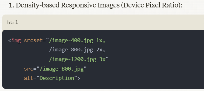
- Provides different image resolutions for different device pixel ratios
- Good for retina and high-DPI displays
- Browser automatically chooses the best version
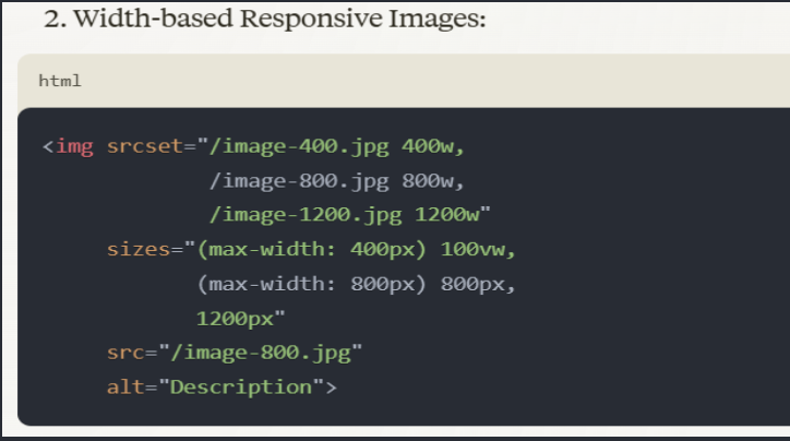
- Width-based Responsive Images:

- Provides different image sizes for different viewport widths
- Uses sizes attribute to help browser choose the right image
- More flexible than density-based approach

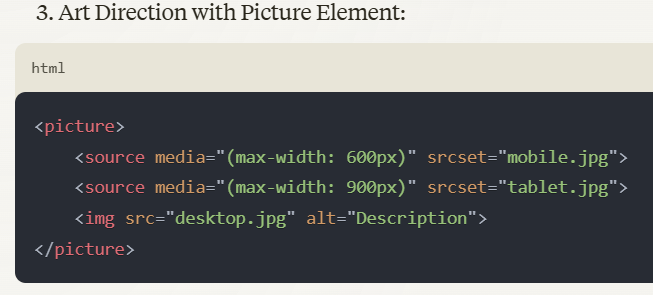
3. Art Direction with Picture Element:
- Allows different image crops/aspects for different devices
- Complete control over image presentation
- Can combine with srcset for more flexibility
Recommended Image Sizes: For best compatibility
- Mobile: 320-480px width
- Tablet: 768-1024px width
- Desktop: 1200-1600px width
- Large screens: 1920px+ width
Best Practices:
- Always include fallback src attribute
- Use descriptive alt text
- Specify image dimensions to prevent layout shifts
- Implement lazy loading for better performance
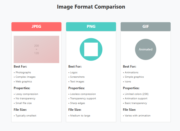
- Consider using WebP format with fallbacks
- Optimize images for each size
- Use appropriate compression levels

